 5-Star Rating!
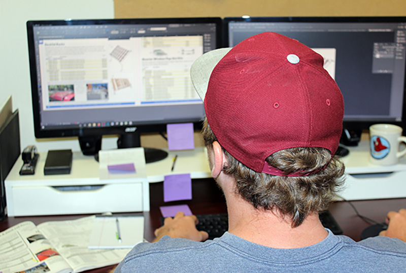
After more than a year of work, I can happily say that it’s done. The newest version of the JBugs product catalog is out in the world. And now that it’s out of my hands and into yours, I have the opportunity to discuss the re-designing process.
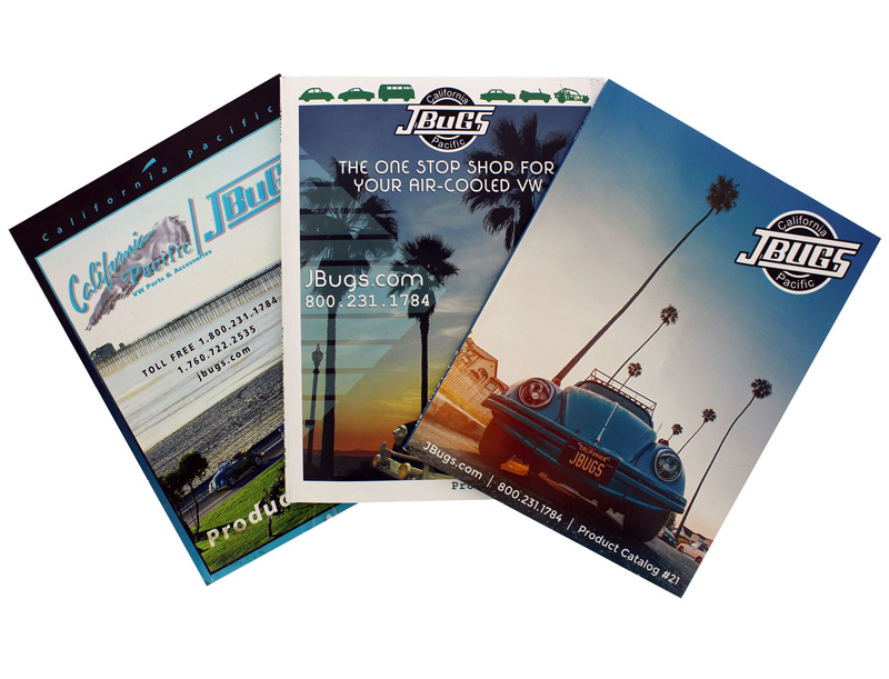
Catalog 21 is the newest iteration of our product catalog and the culmination of more than two decades of work carried out by dozens of people. Since Gary purchased California Pacific JBugs in 1997 numerous people have assisted in building, maintaining, and updating our product catalog. I now have the pleasure of getting to tinker with it.
When planning how we wanted to approach the re-design, we established early on that we wanted to maintain the same structure, so our customers could still turn to a given page and find exactly what they needed.
For that reason, most of the changes we made were to written and visual content. We colorized the entire catalog, changed the typeface (font), re-designed many of the diagrams and tables, and updated the cover.
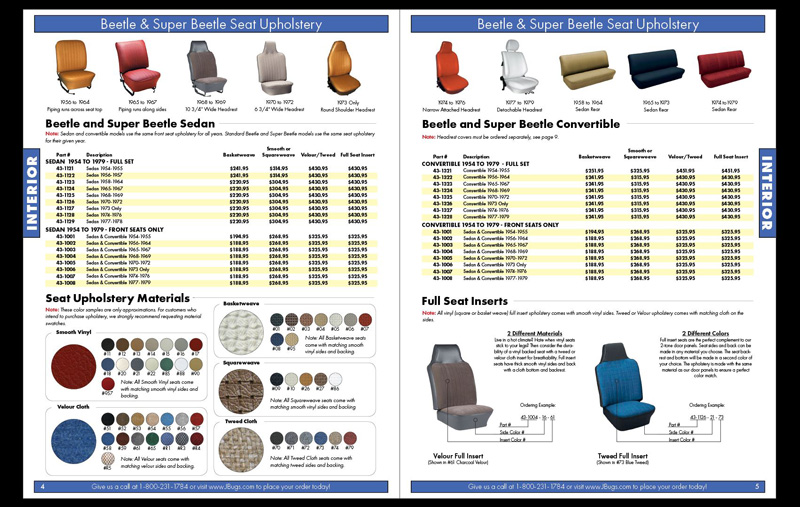
When we added more color images to our catalog last spring, we knew we wanted to redo the entire catalog in color. The pictures were just the first step. Now, our customers don’t have to imagine the color and hope for the best when ordering our parts.
Another huge motivation for this re-design was to clean things up and make the document much more consistent and easy to read. So, we selected one typeface (font) for the entire catalog. We chose the Futura type family because it is incredibly easy to read at a distance and was commonly used in auto manufacturer ads during the 50s, 60s, and 70s. If it looks familiar, that’s why!
We also eliminated unnecessary text and removed parts that are no longer popular, replacing them with things we know our customers want to buy. In my opinion, this was the most difficult part of the process.
Just addressing the issues with the product tables and pricing was a 2-month slog through countless excel spreadsheets, but it was worth it.
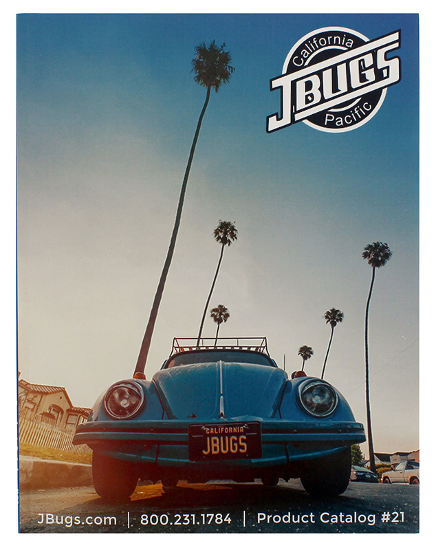
There is no better way to signal a massive change than to put it right at the front, so we completely re-designed our cover styling. If you’ve seen previous covers, the “vibe” is exactly as it’s always been, but the look is completely new. We’re located in beautiful Oceanside, CA and love it here, so a bug cruising down a road flagged by palm trees was right on the money for us.
Moving forward, we plan to roll out a new series of diagrams that will be consistent with what we offer on our website. Likewise, we will be focusing on adding more references to the website, so you know exactly where to find it online if it’s not in the catalog. And most importantly, we will be offering new products!
Despite the length of the project and high standard to uphold, I enjoyed the process immensely. It’s the best version we’ve ever put out and I’m proud to have been a part of it.
Unfortunately, no matter how diligent you are during the review process, errors (however minor) will crop up as more eyes are on it. If you find any mistakes or have suggestions for how we can improve with the next version, please don’t hesitate to reach out to me directly. I would love to hear your perspective.
You can email me any time at [email protected]. If you do shoot me an email with revisions, please title the subject line “Catalog 21 Revision”, so that I am able to distinguish your message from other incoming emails. Thanks for reading!
-Tim
